
Data
How to make a choropleth map with Google Fusion Tables
Sophie Murray-Morris shows you how to make an easy choropleth map using Google Fusion Tables to help you visualise your data.
Data
Sophie Murray-Morris shows you how to make an easy choropleth map using Google Fusion Tables to help you visualise your data.

How-To
Data journalism is ever-evolving and so are the tools of the trade. Aside from Microsoft Excel (which I’ve blogged about here and here), these are the tools which are, in my opinion, the most useful for data journalism at the moment. Google Fusion Tables The gateway drug for

Data
I decided to experiment with Google Fusion Tables after my past Google Heatmap attempts, and create a map which was much more interactive. I submitted Freedom of Information requests to the Department of Health and other governmental organisations for information on cancer rates by primary care trust (PCT) or other

News
Yesterday the final results were in for Thursday’s 2013 council elections, and true to form some of the biggest media publications were not content with simply stating by numbers which councils had won or lost seats (à la the less than inspiring Independent and Spectator’s election results run-
Data
When I say "dummies", I really mean myself. Just so we're all aware. Anyway, for my final project I plan to make a fusion table of NIMBY requests in the UK, but before I do that, I figured that I had to practice. I've
How-To
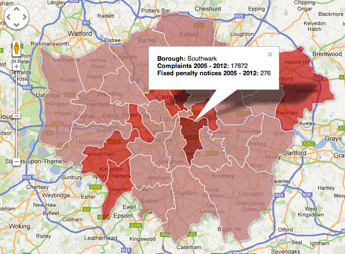
Henry Taylor explores Google Fusion Tables in order to make an interactive map